


✅ Intro
Vite
Vite is a modern build tool that provides easier setup and faster build time for modern web projects. It supports Javascript and Typescript frameworks like React, Preact, Vue, svelte, lit, and Vanilla.
Read more: https://vitejs.dev/guide/why.html
For this article, to create a library of React we need the support of Vite. It can be done with just a few things:-
Vite Setup
Vite Config
Add your code
Build your code
and It's done
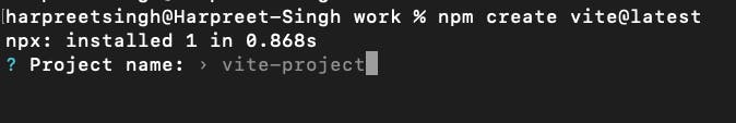
Step 1: Vite Setup
We will setup a React-JS project with vite.
Run the command below and follow the instructions
npm create vite@latest react
Enter the project name.
Select framework

Select Language

cd <project folder> and Install dependencies npm i
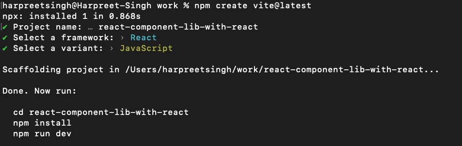
And, it's done
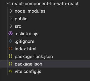
Folder Structure
Step 2: Add React Components code
Add a new folder to src folder - components
Add the code for Button component -the component code, styling and create a common index.js file that will import the components and export them.
src/components/Button/index.jsx - Note .jsx here.
import PropTypes from 'prop-types'; // ES6
import StyledButton, { StyledSpanContainerForIcon } from './Button.style';

function Button({ children, ...props }) {
    return <StyledButton {...props}>{children}</StyledButton>;
}

export const IconButton = ({ text, icon, left = false, ...props }) => {
    return (
        <StyledButton left={left} {...props}>
            {text && <StyledSpanContainerForIcon left={left}>{text}</StyledSpanContainerForIcon>}
            {typeof icon === 'function' ? icon() : icon}
        </StyledButton>
    );
};

export default Button;

Button.propTypes = {
    children: PropTypes.element
}

IconButton.propTypes = {
    text: PropTypes.string,
    icon: [PropTypes.func, PropTypes.element],
    left: PropTypes.bool
}
src/components/Button/Button.style.js
import tw, { styled } from 'twin.macro';

const defaultButtonStyle = tw`
    flex
    justify-center
    items-center

    rounded
    text-sm
    px-5
    py-2
    cursor-pointer
    border-solid
`;

const primaryStyle = tw`
    text-white
    bg-primary
    border-none

    hover:shadow-base
    hover:border-border-base

    active:bg-primary-active
    active:drop-shadow-none

    focus:bg-primary-active
    focus:drop-shadow-none

    disabled:opacity-65
    disabled:cursor-not-allowed
`;

const secondaryStyle = tw`
    bg-white
    border
    border-red-shade
    text-red-shade

    hover:bg-secondary
    hover:shadow-base

    active:bg-secondary
    active:shadow-base

    focus:bg-secondary
    focus:shadow-base

    disabled:opacity-65
    disabled:drop-shadow-none
    disabled:bg-white
    disabled:cursor-not-allowed
`;

const tertiaryStyle = tw`
    bg-white
    border
    border-tertiary
    text-text-tertiary

    hover:bg-secondary
    hover:shadow-base

    active:bg-secondary
    active:shadow-base

    focus:bg-secondary
    focus:shadow-base

    disabled:opacity-65
    disabled:drop-shadow-none
    disabled:bg-white
    disabled:cursor-not-allowed
`;

const quarternaryStyle = tw`
    bg-white
    border-none
    text-text-tertiary

    hover:bg-quarternary

    active:bg-quarternary

    focus:bg-quarternary

    disabled:bg-quarternary
    disabled:opacity-65
    disabled:cursor-not-allowed
`;

const ButtonType = ({ primary, secondary, tertiary, quarternary }) => [
    defaultButtonStyle,
    primary && primaryStyle,
    secondary && secondaryStyle,
    tertiary && tertiaryStyle,
    quarternary && quarternaryStyle,
    !primary && !secondary && !tertiary && !quarternary && primaryStyle, // default primary
];

// Icon Button Styles
const iconRowReverse = tw`
    flex-row-reverse
`;
const IconButton = ({ left = false }) => [left && iconRowReverse];

// Append Icon Button style to the same styled button
const StyledButton = styled.button(() => [ButtonType, IconButton]);
export default StyledButton;

// Manage margin between button text and icon
const iconStyleLeft = tw`
    ml-1
`;
const iconStyleRight = tw`
    mr-1
`;
const IconAlignment = ({ left = false }) => [left ? iconStyleLeft : iconStyleRight];
export const StyledSpanContainerForIcon = styled.span(() => [IconAlignment]);
src/component/index.js
export { default as Button } from './Button';
export { IconButton } from './Button';
tailwind.config.js
// eslint-disable-next-line no-undef
module.exports = {
    content: ['./src/**/*.{js,jsx,ts,tsx}'],
    theme: {
        extend: {
            colors: {
                'red-shade': '#eb575c',
                'primary': '#EA575C',
                'primary-active': '#E62930',
                'border-base': '#adadad',
                'secondary': '#F5F5F5',
                'tertiary': '#DDDDDD',
                'text-tertiary': '#333333',
                'quarternary': '#D9D9D9',
            },
        },
        boxShadow: {
            base: '0 3px 6px rgb(0 0 0 / 16%), 0 3px 6px rgb(0 0 0 / 23%)'
        },
        opacity: {
            65: '.65',
        }
    },
    plugins: [],
};
package.json
{
  "name": "react-vite-lib",
  "private": true,
  "version": "0.0.5",
  "type": "module",
  "exports": {
    ".": {
      "import": "./dist/react-vite-library.es.js",
      "require": "./dist/react-vite-library.umd.js"
    }
  },
  "scripts": {
    "dev": "vite",
    "build": "vite build",
    "lint": "eslint src --ext js,jsx --report-unused-disable-directives --max-warnings 0",
    "preview": "vite preview"
  },
  "peerDependencies": {
    "react": "^18.2.0",
    "react-dom": "^18.2.0"
  },
  "files": [
    "dist"
  ],
  "dependencies": {
    "@emotion/react": "^11.10.8",
    "@emotion/styled": "^11.10.8",
    "react": "^18.2.0",
    "react-dom": "^18.2.0",
    "tailwindcss": "^3.3.2",
    "twin.macro": "^3.3.1",
    "vite-plugin-babel-macros": "^1.0.6"
  },
  "devDependencies": {
    "@types/react": "^18.0.28",
    "@types/react-dom": "^18.0.11",
    "@vitejs/plugin-react": "^4.0.0",
    "eslint": "^8.38.0",
    "eslint-plugin-react": "^7.32.2",
    "eslint-plugin-react-hooks": "^4.6.0",
    "eslint-plugin-react-refresh": "^0.3.4",
    "vite": "^4.3.2"
  }
}
don't forget to install dependencies like emotions, tailwind, twi-macro as we are using them to build our component libraries.
Runt the command npm i.
Note: export, files, peerDependencies in the package.json. These are required to build and use the build package in the app when we install the library package.
Step 3: Build the Component Library
vite.config.js - Let's setup vite config that can be used to build the react-js code to make a component library. Copy & paste this vite config and install the new dependencies used in the config.
install vite-plugin-babel-macros for babel macros
import { resolve } from 'node:path'
import macrosPlugin from 'vite-plugin-babel-macros';

import react from '@vitejs/plugin-react'
import { defineConfig } from 'vite'

import * as packageJson from './package.json'
// https://vitejs.dev/config/

export default defineConfig(() => ({
  plugins: [
    react(),
    macrosPlugin()
  ],
  define: {
    'process.env': {},
  },
  build: {
    lib: {
      entry: resolve('src', 'component/index.js'),
      name: 'ReactViteLibrary',
      formats: ['es', 'cjs', 'umd'],
      fileName: (format) => `react-vite-library.${format}.js`,
    },
    manifest: true,
    rollupOptions: {
      external: [...Object.keys(packageJson.peerDependencies)],
    },
  }
}))
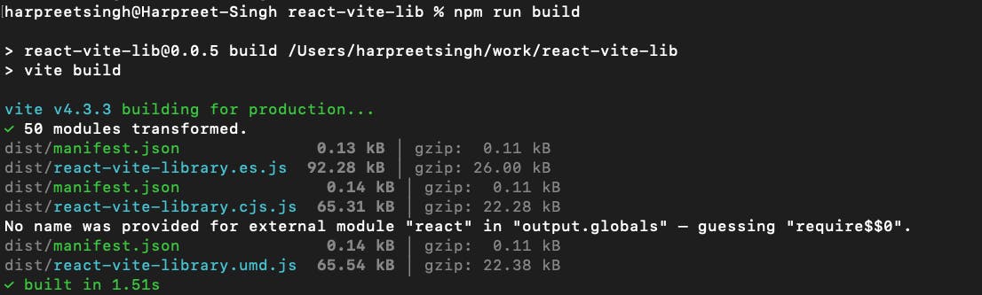
Now, Let's build our component library
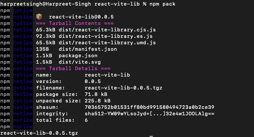
Build the Library
npm run build
Make a package
npm pack
Note: Make sure to update the version in the package.json after every new build
To use the library in an app
Go to the app and install the library package as in the below-mentioned format
npm add <package-path>/<package-version.tgz
command
npm add ../react-vite-lib/react-vite-lib-0.0.5.tgz
and It's done.
Your library is built and ready to use.
Check the complete code here on GitHub
If you have reached here, I would appreciate the time and effort you put into going through this article. I hope it is worth your time. Please leave honest feedback and let me know how can I improve this project.
I will keep adding more components to this repo soon. The planned components are InputBox, DateRangePicker, Toggle, Dropdwn, MultiBox, ComboBox, and Form. But the style would be as per my current projects requirement only, you can fork the repo and change it as per your need. I will also add proper documentation, storybook integration and jest along with the code.
✅ Intro
I hope you are enjoying this series and learning something useful. Please help me improve my work by providing proper feedback via adding comments or do send me an email.