


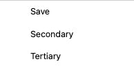
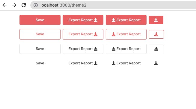
✅ Intro
Design System - Button
Approach
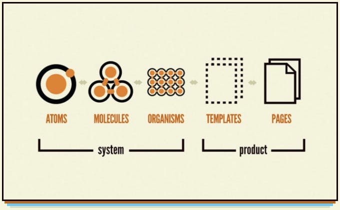
Break the design into the atomic level and create atomic styles.
Apply one or more atomic properties/styles to make a Molecule.
Combine Molecules to make an Organism and then Templates...
Let's see how we can proceed with the Button as per the design at the top:-
Step 1 - Atoms: Break the design into atomic levels
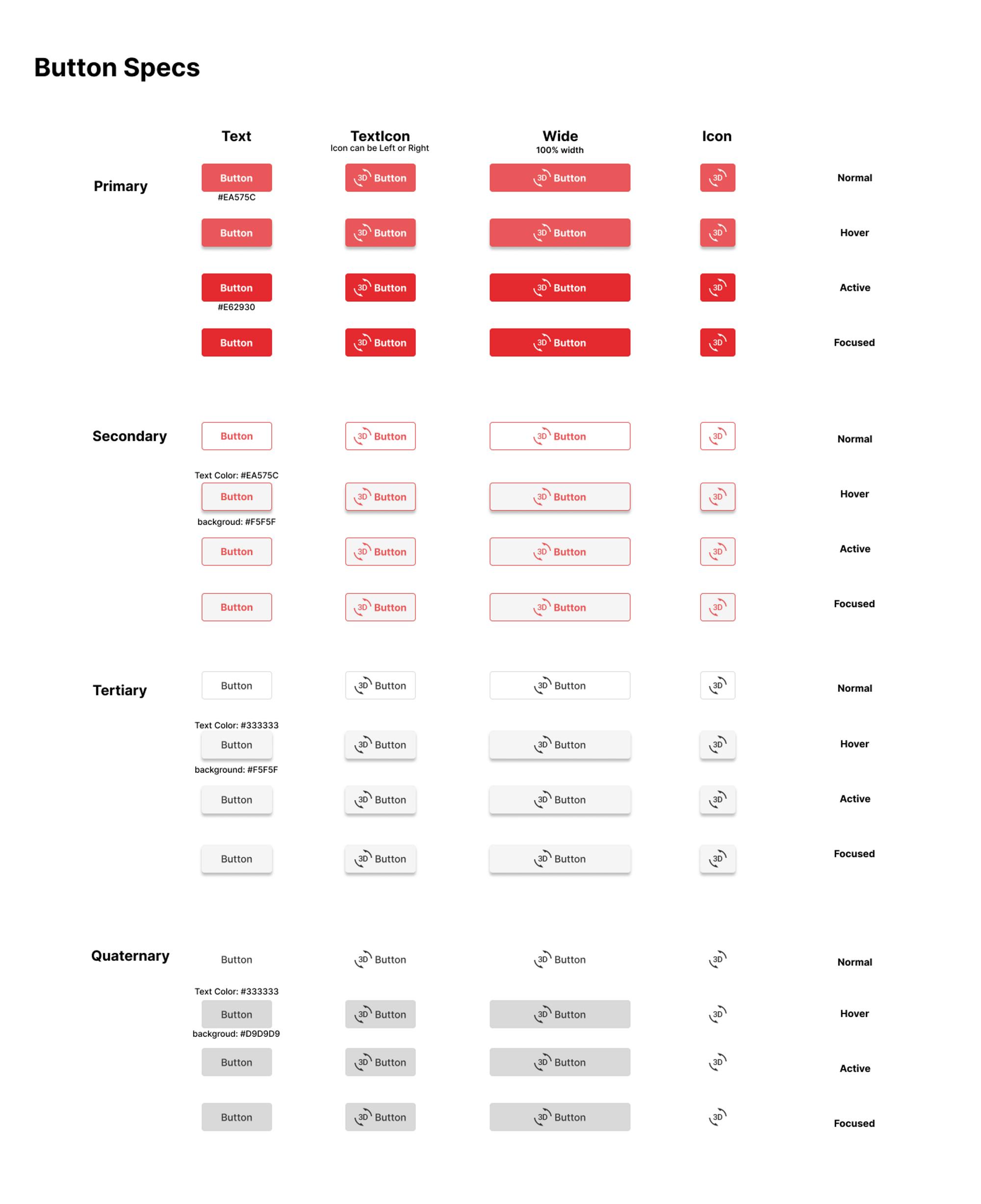
Anatomy of the Button
Types/Variants of Buttons - Primary, Secondary, Tertiary, Quarternary
Text Color, Background Color as mentioned in the design for each variant and button state.
Button padding, margin - Let's take an arbitrary value and use tailwindcss classes
px-5 and py-2for now.Opacity for the disabled state -
0.65Button Size - Height, Width - As wide as text/children or it can cover 100% width if it's a full-width Button variant.
Button Text - Fonts, Font Style, Font Size
Button Shadow - let's consider a base shadow -
0 3px 6px rgb(0 0 0 / 16%), 0 3px 6px rgb(0 0 0 / 23%)Button With or Without Icon
Button States - Active, Hover, Focus, Disabled - colors as mentioned in the design
Border Width - 1px, Border Radius - 4px
We must consider all these basic properties before starting the implementation and we should define these in the code first. Once we defined them, we can simply use the same at multiple places to avoid any duplicate values and to maintain consistency across the UI.
As already mentioned, we will be using tailwindcss, so first, we will define the properties mentioned above in the tailwind.config.js if it is not already matching any pre-defined tailwind utility classes.
tailwind.config.js
// eslint-disable-next-line no-undef
module.exports = {
    content: ['./src/**/*.{js,jsx,ts,tsx}'],
    theme: {
        extend: {
            colors: {
                'red-shade': '#eb575c',
                'primary': '#EA575C',
                'primary-active': '#E62930',
                'border-base': '#adadad',
                'secondary': '#F5F5F5',
                'tertiary': '#DDDDDD',
                'text-tertiary': '#333333',
                'quarternary': '#D9D9D9',
            },
        },
        boxShadow: {
            base: '0 3px 6px rgb(0 0 0 / 16%), 0 3px 6px rgb(0 0 0 / 23%)'
        },
        opacity: {
            65: '.65',
        }
    },
    plugins: [],
};
Now we have defined all the missing and reusable properties in the beginning and now in the code, we just need to put the right class as per the design requirement. i.e
Step 2: Molecule: Combine one or more atomic properties to make a Molecule
Here we will make a Molecule i.e. a Button by combining atomic properties like color, size, border, opacity, label, Icon etc.
Step 3: Organism: Combine Molecules to make an Organism
In this, we will combine two or more Molecules like a Button, InputBox, CheckBox, Dropdown etc to make a large component - Form(an Organism), SideBar, Header etc.
So let's start with the code and before that, we need to set up a project and its dependencies.
Code - Button
We will start with a basic setup of React, tailwind, and twin macro and we will implement a Button with all its variants. Later on, we will learn, how to build our component library and use it in a different app.
Setup & Implementation
Step 1: Follow this folder structure
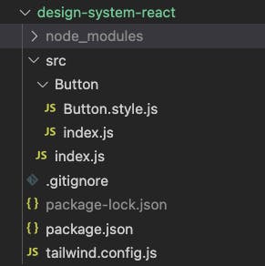
package.json
Copy the package.json file and run the command npm install.
Step 2: Create a Button Component
For Button component, create a folder as src/Buton and add files index.js and Button.style.js.
In Button/Button.style.js add a variable defaultButtonStyle and add some default style of the button as per the requirement using the tw import from twin.macro and use it as suggested in the code below with a function ButtonType and then use the ButtonType function to create an instance of StyledButton.
    import tw, { styled } from 'twin.macro';

    const defaultButtonStyle = tw`
    flex
    justify-center
    items-center

    rounded
    text-sm
    px-5
    py-2
    cursor-pointer
    border-solid
    `;

    const ButtonType = () => [defaultButtonStyle];

    const StyledButton = styled.button(() => [ButtonType]);

    export default StyledButton;
Button/index.js
import the StyledButton from the Button.style.js and use it in the component as in the code below.
  import React from 'react';
  import StyledButton from './Button.style';

  function Button({ children, ...props }) {
      return <StyledButton {...props}>{children}</StyledButton>;
  }

  export default Button;
With this, we have now added just a default style to our button component with the styled-components way using twin and tailwind and it looks like this.
Image of buttons with default styling - Just plain buttons
It looks very plain and incomplete. It does not look like the button as per the design yet because we haven't added the actual styles.
Button Variants
In the previous section, we have just passed the default style to the styled.button function. Now with the help of our powerful tool Twin, we can compose together multiple styles and conditionally add or remove styles using basic JS operations.
In this section, we will see how we can use it to create different variants of a button by first implementing one variant and then similarly adding more variants.
In the Button.style.js , you might have noticed that ButtonType and StyledButton both functions are returning an Array.
  .
  .
  const ButtonType = () => [defaultButtonStyle];
  .
  .
  const StyledButton = styled.button(() => [ButtonType]);
It can be used to add more styles to the Button Component by adding other style variables to the ButtonType and extend the style types of buttons like Primary Button, Secondary Button etc and similarly, we can add other style types like Size like Small, Medium, and Large and so on. Let's see a rough implementation of this to understand it properly.
  .
  .
  const defaultButtonStyle = tw`<some styles>`
  // Type - Atom
  const Primary = tw`<some styles>`
  const Secondary = tw`<some styles>`
  const PrimaryButton = () => [defaultButtonStyle, Primary];
  const SecondaryButton = () => [defaultButtonStyle, Secondary];
  // Size - Atom
  const Small = tw`<some styles>`
  const Medium = tw`<some styles>`
  const Large = tw`<some styles>`
  const SmallButton = () => [Small];
  const MediumButton = () => [Medium];
  const LargeButton = () => [Large];
  .
  .
  .
  //Combine Type and Size to create all combinations of Button type and Size like Primary Small, Primary Medium, Secondary Large

  // Molecule = Atom + Atom
  // PrimarySmall = Primary Atom + Small Atom
  const PrimarySmall = styled.button(() => [PrimaryButton, SmallButton]);
  const PrimaryMedium = styled.button(() => [PrimaryButton, MediumButton]);
  const SecondaryLarge = styled.button(() => [SecondaryButton, LargeButton]);
This is the power of twin-macro when combined with tailwindcss and styled-components. If we can effectively use and combine all these different characteristics of the button logically with each other we can create all the different possible combinations with very less code.
Let's start with our first variant.
Primary Button.
For this, we will first add a new style variable
primaryStylewith all the styles required to make a primary button and its different states likehover, active, disabledinbutton.style.jsasimport tw, { styled } from 'twin.macro'; // Atom // Single Responsibility - S.O.L.I.D const defaultButtonStyle = tw` flex justify-center items-center rounded text-sm px-5 py-2 cursor-pointer border-solid `; // Atom // Single Responsibility - S.O.L.I.D const primaryStyle = tw` text-white bg-primary border-none hover:shadow-base hover:border-base active:bg-primary-active active:shadow-none focus:bg-primary-active focus:shadow-none disabled:opacity-65 disabled:cursor-not-allowed `; // append primary style to the default style // Open/Closed - S.O.L.I.D const ButtonType = () => [defaultButtonStyle, primaryStyle]; // Molecule const StyledButton = styled.button(() => [ButtonType]); export default StyledButton;In
button.style.jswe are using some custom tailwind classes which we need to declare in thetailwind.config.js// eslint-disable-next-line no-undef module.exports = { content: ['./src/**/*.{js,jsx,ts,tsx}'], theme: { extend: { colors: { 'primary': '#EA575C', 'primary-active': '#E62930', 'border-base': '#adadad' }, }, boxShadow: { base: '0 3px 6px rgb(0 0 0 / 16%), 0 3px 6px rgb(0 0 0 / 23%)' }, opacity: { 65: '.65', } }, plugins: [], };Now, our buttons will render like this.
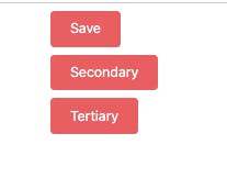
You can notice, they all look the same now because we have just one variant and we haven't applied any condition to render only
primaryvariant if theprimaryprop is passed.To do this, we can use a prop(
Style-Prop) to the style which will conditionally add/remove theprimaryStyleto the returned array of ourButtonTypefunction.Updated
Button.style.jsimport tw, { styled } from 'twin.macro'; // Atom // Single Responsibility - S.O.L.I.D const defaultButtonStyle = tw` flex justify-center items-center rounded text-sm px-5 py-2 cursor-pointer border-solid `; // Atom // Single Responsibility - S.O.L.I.D const primaryStyle = tw` text-white bg-primary border-none hover:shadow-base hover:border-border-base active:bg-primary-active active:drop-shadow-none focus:bg-primary-active focus:drop-shadow-none disabled:opacity-65 disabled:cursor-not-allowed `; // Our first variant - primary // Open/Closed - S.O.L.I.D const ButtonType = ({ primary }) => [ defaultButtonStyle, primary && primaryStyle, ]; // Molecule // Open/Closed - S.O.L.I.D const StyledButton = styled.button(() => [ButtonType]); export default StyledButton;Now, we can use the Button component in our react code as
 import React from 'react';
 import { Button } from 'design-system-react';

 function Theme() {
     return (
         <main className="px-20 pr-36 h-full">
             <div className="my-2">
                 {/* Primary Button */}
                 <Button primary>Save</Button>
             </div>
             <div className="my-2">
                 <Button>Secondary</Button>
             </div>
             <div className="my-2">
                 <Button>Tertiary</Button>
             </div>
         </main>
     );
 }

 export default Theme;
Now our Buttons will render like this

As we have passed the
primaryprop to theSavebutton only, the style has been applied to that button only and all other buttons are using thedefaultstyle.
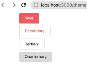
Secondary, Tertiary and Quarternary Button
To add other styles likeSecondary, Tertiary, Quarternarywe need to add the styles for them respectively in a similar manner in theButton.style.jsand then pass the relevant prop to the Button component.Updated
Button.style.jsimport tw, { styled } from 'twin.macro'; const defaultButtonStyle = tw` flex justify-center items-center rounded text-sm px-5 py-2 cursor-pointer border-solid `; const primaryStyle = tw` text-white bg-primary border-none hover:shadow-base hover:border-border-base active:bg-primary-active active:drop-shadow-none focus:bg-primary-active focus:drop-shadow-none disabled:opacity-65 disabled:cursor-not-allowed `; const secondaryStyle = tw` bg-white border border-red-shade text-red-shade hover:bg-secondary hover:shadow-base active:bg-secondary active:shadow-base focus:bg-secondary focus:shadow-base disabled:opacity-65 disabled:drop-shadow-none disabled:bg-white disabled:cursor-not-allowed `; const tertiaryStyle = tw` bg-white border border-tertiary text-text-tertiary hover:bg-secondary hover:shadow-base active:bg-secondary active:shadow-base focus:bg-secondary focus:shadow-base disabled:opacity-65 disabled:drop-shadow-none disabled:bg-white disabled:cursor-not-allowed `; const quarternaryStyle = tw` bg-white border-none text-text-tertiary hover:bg-quarternary active:bg-quarternary focus:bg-quarternary disabled:bg-quarternary disabled:opacity-65 disabled:cursor-not-allowed `; const ButtonType = ({ primary, secondary, tertiary, quarternary }) => [ defaultButtonStyle, // Atom primary && primaryStyle, // Atom secondary && secondaryStyle, // Atom tertiary && tertiaryStyle, // Atom quarternary && quarternaryStyle // Atom ]; // Molecule const StyledButton = styled.button(() => [ButtonType]); export default StyledButton;Updated
tailwind.config.js// eslint-disable-next-line no-undef module.exports = { content: ['./src/**/*.{js,jsx,ts,tsx}'], theme: { extend: { colors: { 'red-shade': '#eb575c', 'primary': '#EA575C', 'primary-active': '#E62930', 'border-base': '#adadad', 'secondary': '#F5F5F5', 'tertiary': '#DDDDDD', 'text-tertiary': '#333333', 'quarternary': '#D9D9D9', }, }, boxShadow: { base: '0 3px 6px rgb(0 0 0 / 16%), 0 3px 6px rgb(0 0 0 / 23%)' }, opacity: { 65: '.65', } }, plugins: [], };Now if we pass
primaryprop the style related toprimaryvariant will be applied and if we passsecondaryprop thesecondarybutton will get rendered. Check the code below.import React from 'react'; import { Button } from 'design-system-react'; function Theme() { return ( <main className="px-20 pr-36 h-full"> <div className="my-2"> {/* Primary Button */} <Button primary>Save</Button> </div> <div className="my-2"> {/* Secondary Button */} <Button secondary>Secondary</Button> </div> <div className="my-2"> {/* Tertiary Button */} <Button tertiary>Tertiary</Button> </div> <div className="my-2"> {/* Quarternary Button */} <Button quarternary>Quarternary</Button> </div> </main> ); } export default Theme;Our Button component will now render in the browser like this.
You can see in the style file that just by using some basic JS operations we have extended the capability of our Button component by using
tailwindcss, styled-component and twin-macrotogether. The actual code of the Button Component is still just a two-three line code. All other logic is in the style file which is also just a simple boolean operation.import React from 'react'; import StyledButton from './Button.style'; function Button({ children, ...props }) { return <StyledButton {...props}>{children}</StyledButton>; } export default Button;We can further extend it to set a default variant if no other variant is passed to the Button component.
Let's makeprimarya default variant.Updated
Button.style.jsconst ButtonType = ({ primary, secondary, tertiary, quarternary }) => [ defaultButtonStyle, primary && primaryStyle, secondary && secondaryStyle, tertiary && tertiaryStyle, quarternary && quarternaryStyle, !primary && !secondary && !tertiary && !quarternary && primaryStyle, // default primary ];Here, we can see that if we pass no variant the
primaryStylewill be applied.import React from 'react'; import { Button } from 'design-system-react'; function Theme() { return ( <main className="px-20 pr-36 h-full"> <div className="my-4"> <Button>Save - Default Primary</Button> <Button secondary>Secondary</Button> <Button tertiary>Tertiary</Button> </div> </main> ); } export default Theme;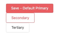
Button with default variant -
primaryIconButton
After successfully adding a few variants to the Button, let's create a new type of button that can have an Icon. We will extend the same Button Component to create a new IconButton.
In this, we will control the position of the icon via a prop. We will use a propleftto position the icon to the left or right of the label/text of the button if the button has some label/text.Updated
Button/index.js
It is using the sameStyledButtoncomponent withiconandtextas children and with a new propleft.import React from 'react'; import StyledButton, { StyledSpanContainerForIcon } from './Button.style'; function Button({ children, ...props }) { return <StyledButton {...props}>{children}</StyledButton>; } // Liskov Substitution - S.O.L.I.D export const IconButton = ({ text, icon, left = false, ...props }) => { return ( <StyledButton left={left} {...props}> {text && <StyledSpanContainerForIcon left={left}>{text}</StyledSpanContainerForIcon>} {typeof icon === 'function' ? icon() : icon} </StyledButton> ); }; export default Button;Updated
Button.style.js// earier button styles . . . // Atom // Icon Button Styles const iconRowReverse = tw` flex-row-reverse `; const IconButton = ({ left = false }) => [left && iconRowReverse]; // Molecule // Append Icon Button style to the same styled button const StyledButton = styled.button(() => [ButtonType, IconButton]); export default StyledButton; // Atom // Manage margin between button text and icon const iconStyleLeft = tw` ml-1 `; // Atom const iconStyleRight = tw` mr-1 `; const IconAlignment = ({ left = false }) => [left ? iconStyleLeft : iconStyleRight]; // Molecule export const StyledSpanContainerForIcon = styled.span(() => [IconAlignment]);With the new changes in the Button component and with the updated styles, our IconButton inherits all the variants of the Button along with the variants defined specifically for the IconButton without many changes.
We can now create the below-mentioned variants of an IconButton:Primary/Secondary/Tertiary/QuarternaryButton withTextand anIconon the LeftPrimary/Secondary/Tertiary/QuarternaryButton withTextand anIconon the RightPrimary/Secondary/Tertiary/QuarternaryButton with anIconand without the Text
So that's how we can leverage the composite nature of twin-macro to create different variants of any react component and build our Design System.
Check the complete code on the GitHub
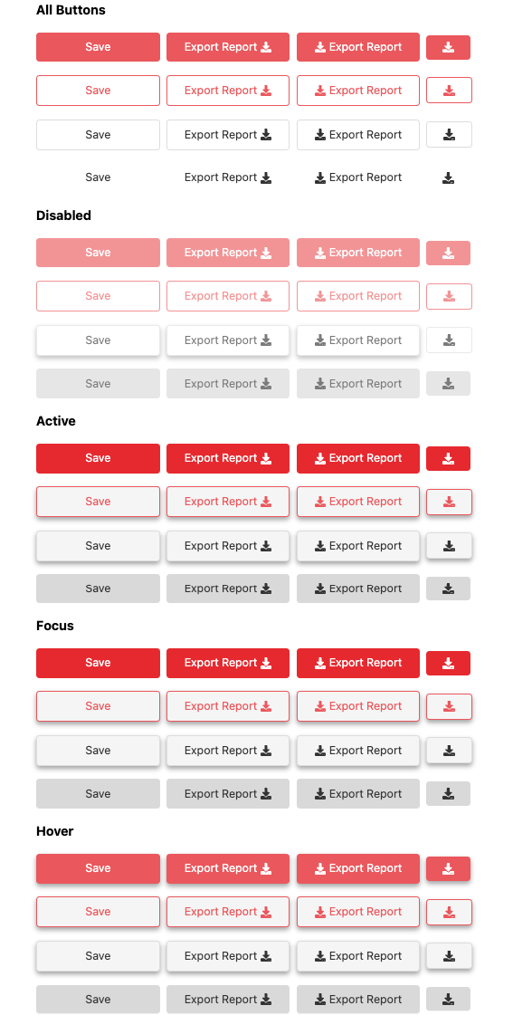
Preview of Complete Design System for a Button
If you can add all the variants of the Button component on one page, it will look like this.
Button Type - Primary, Secondary, Tertiary, Quaternary - Primary as default
IconButton - With Text, Icon Only, Left Icon, Right Icon
Includes Button states - Active, Hover, Disabled
And if you add different states as well, you will have the complete Design System for your button as shown in the image below.
Final Screenshot from the browser
Compare it with the Figma design we have seen at the top of this article.
Conclusion
In this article, we have seen how by using some awesome libraries like tailwind and twin-macro we have created different variants of a Button component.
First, We have defined the basic styles the Atoms in the
tailwind.config.js
By composing different styles using twin-macro we create composed, conditionally renderable styles to create our Button component.
Then, We combined different Atoms to make a Molecule using styled-components and a few JS operations in the
Button.style.js
If we follow the same logic and style pattern for other components we can add more components to our design system.
Similarly, we can create more Molecules by combining Atoms in a different pattern as required.
That's it, we have implemented our first Design-System-based component in React.
In our future articles, we will cover other components like InputBox, DateRangePicker, Dropdown, MultiSelect, ComboBox etc and use them to create a Form etc. But before that, we need to build our code to create our own React UI Component library.
We will create an Organism(Form) by combining different Molecules in a different pattern as required.
In the next article, we will learn, two different methods to build our component library using two different packages:
with MicroBundle - the Legacy package and,
with Vite - the Modern package
✅ Intro
I hope you are enjoying this series and learning something useful. Please help me improve my work by providing proper feedback via adding comments or do send me an email.